Our kitchen was undoubtedly thought of as state-of-the-art when it was built. But 50 years later, it’s dark, ugly, and inconvenient. Here’s what it looked like before we fixed it up:
The sea foam green backsplash tiles had been carefully matched to the wall color and the accent color of the linoleum flooring. We admired the backsplash for about 5 seconds before ripping it out. While we were at it, we also pulled down the soffit above the cabinets – who needs it? It opened up the kitchen a bit, which was desperately needed. I wanted to enlarge the window opening but the budget did not allow. The budget also did not allow for recessed lighting in the ceiling but we put it in anyway. Luckily, we found a wonderful electrician who let my husband help him with the installation, shortening the time and costing us less money.
Over the years, we slowly replaced all the appliances. We chose stainless steel as our finish color since it’s my fave. We replaced the sink and the faucet and pretty much removed, replaced, covered or updated every surface in the kitchen.
The Materials List
Here are the items I chose for the kitchen update.
Sink and Faucet
I discovered these granite sinks during my last kitchen renovation. How could a sink be made from granite you ask? Well, they take the granite and crunch it all up and mix it with resin and pour it into a form and out comes a really cool, durable, and easy-to-clean sink that is not only attractive but scratch, heat and stain resistant.
The model I chose can be used as an undermount or drop-in sink which I used in both ways, first with the old, ugly laminate countertop and then with the beautiful new granite countertop. Cost was $183.20.
For the faucet I wanted something tall that you could place a stock pot under and be able to fill it easily. I chose a brushed stainless steel model something like this:
I chose not to use the long plate at the bottom since I think it’s ugly. My plumber just installed the faucet directly onto the countertop. I think it looks much better that way. Can’t remember what this cost – I guess around $100.
Lighting
We hired an electrician to install recessed lighting in the ceiling. This was an expense I did not want to incur but the brightness gained from having this extra lighting was totally worth the cost.
I purchased the accent lighting from Pottery Barn. For over the sink I chose this Harlowe Wire Glass Pendant, “made from molten glass hand blown into an iron farm-wire frame, replicating the repeating hexagons of a honeycomb.”
Above the work island, I hung two Rustic Glass Pendants which showcase “a graceful bell-shaped shade of mouth-blown clear glass.” FYI, they never look this clean in real life, even right after I clean them.
I really love the Harlowe pendant – it’s rustic but updated at the same time. The two rustic pendants over the island are also nice, but they get dirty very quickly and show dust like crazy. Also, the special light bulbs that Pottery Barn uses in the pendants cost a fortune. I buy regular ones and they don’t look as nice. But oh well.
Countertop
I ordered the countertop from Home Depot, choosing a hard-wearing granite in neutral brown, gray, and black. Cost was $1,325.20.
Tile Backsplash
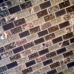
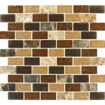
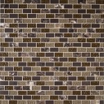
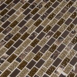
We chose Sonoma Blend glass mosaic tile from Home Depot. It comes in 12″ x 12″ sheets with mesh backing for good adhesion. I estimated that we needed about 250 square feet, which amounts to 25 sheets. We actually used only 23. At $9.99 per square foot, our cost came to around $230. Which was cheap compared to the cost of installation. This might be a DIY project for some of you but I chose to spend my tax return money to hire a contractor for this and I’m glad I did.
-
Sonoma Blend Tile, Installed
-
Sonoma Blend Tile, Store Pic
-
Sonoma Blend Tile, Store Pic
-
Sonoma Blend Tile, Store Pic
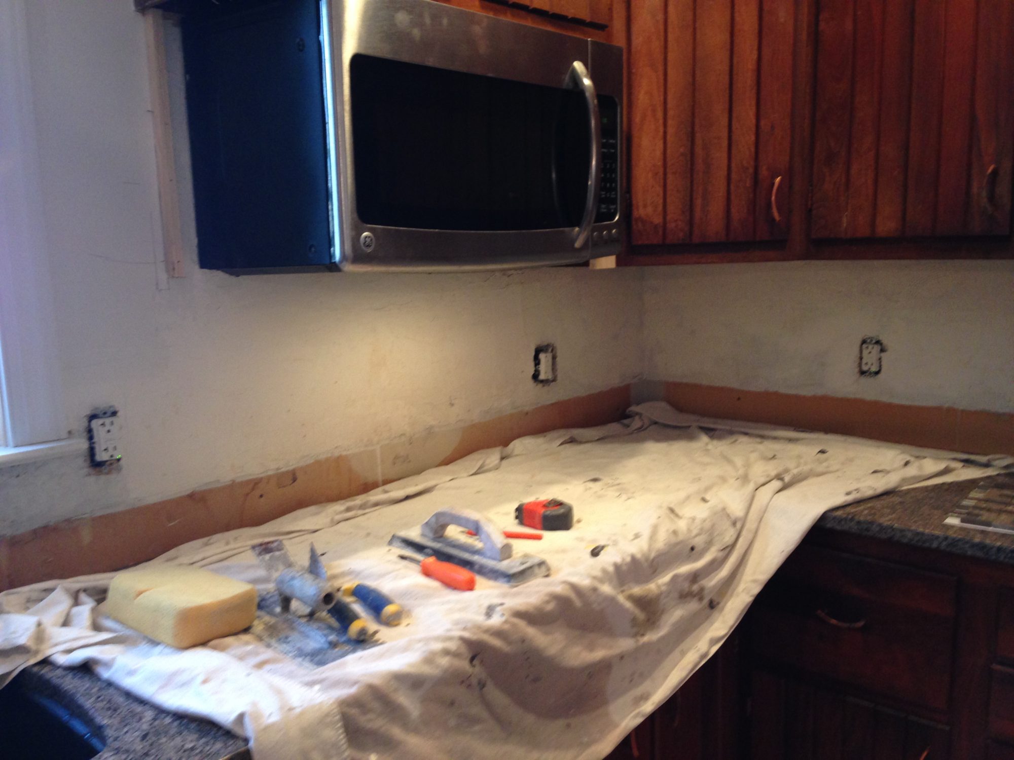
Here are the during and after shots:
I LOVE the new backsplash. The gray, cream, and brown colors complement the granite countertop and the other colors in the kitchen. It’s shiny, beautiful, and easy to clean.
FYI, In case you are dumb like me and don’t know this, you must install the countertop first and the backsplash second.
Flooring
We chose a laminate flooring and installed it right on top of the old linoleum. It’s water resistant but not waterproof so if you’re the kind of person who spills everything, this is not the floor for you. I usually wipe up my spills immediately but my cats are not as conscientious about this as me, thus the swollen floor under the water bowl.
The floor is wearing fairly well; however, the cats don’t seem to respect our kitchen renovation efforts. One of them shoved a heavy ceramic coffee cup from the counter, bouncing it off the floor and leaving a rather sizeable dent. I filled it with a little bit of wood putty and now it’s not so noticeable.
This was a do-it-yourself project for us. You could probably do this too, it’s not hard. You just need a chop saw. Be sure to get the floor boards that already have the under padding glued on which saves you a step. There’s no nailing, they just snap together. Here’s a tip: you are supposed to run your flooring (or scrap wood of matching height) under the dishwasher, NOT right up to the front base of it like we did as this might create problems when replacing or servicing it.
Updating the Cabinets
By far the most difficult and time-consuming task of the kitchen update was painting the cabinets. I ran through numerous ideas about what to do with them, including filling in the grooves with wood putty or joint compound, nailing on a thin sheet of plywood for a smooth surface, or replacing the doors entirely. Here’s what they looked like.
I actually tried the first idea–filling in the grooves–but neither the wood putty nor the joint compound provided a workable solution. Tacking on a thin sheet of wood didn’t really fit my needs either so I resigned myself to living with the grooves. Which meant I had to paint.
Once I made the decision to go with paint, I had to pick a color. I really wanted black cabinets but something held me back. I’m glad I waited because I eventually settled on a nice dark gray color. It took some fiddling and I ended up mixing a custom color but I’m happy with the results. I used General Finishes Milk Paint in gray and chocolate brown.
These were the broad strokes (hehe, get it?) but if you want more detail I chronicle my painting journey, along with my tips for success, in another blog post.
Hardware
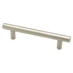
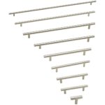
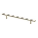
I purchased long brushed stainless steel Liberty pull handles from Home Depot. These things are awesome. They improve the look of the cabinets and complement the vertical grooves that I detest, making the cabinets look modern and sleek.
-
Liberty Stainless Steel Bar Pull, short
-
Liberty Stainless Steel Bar Pull, many lengths
-
Liberty Stainless Steel Bar Pull, medium
They are easy to install and you can get them in many lengths and finishes. Similar items are available on Amazon and other stores.
Here’s what I bought and spent:
| Length | Quantity | Price/Item | Total |
|---|---|---|---|
| 3 3/4″ | 2 | $4.49 | $8.98 |
| 6 5/16″ | 10 | $4.56 | $45.60 |
| 7 9/16″ | 5 | $6.49 | $32.45 |
| 15 1/8″ | 7 | $6.64 | $46.48 |
| 21 3/7″ | 1 | $8.63 | $8.63 |
| $142.14 |
The website says these cabinet pulls are “Sleek and sophisticated, this design makes a contemporary European statement with simplistic, straight lines. Multiple finishes and sizes available. Installs easily with included hardware and is a noticeable change for any cabinetry.” I would have to agree!
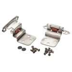
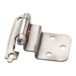
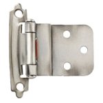
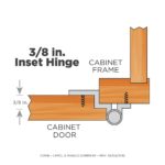
Of course I also had to switch out the old copper hinges. I could have (and probably should have) tried to spray paint them but I decided not to, in fear of the paint flaking and chipping off and looking bad. I purchased 36 new Liberty Antique Pewter Self-Closing Inset Hinges from Home Depot to stick with the burnished silver theme for the metals in the kitchen.
-
Liberty Set of Antique Pewter Self-Closing Inset Hinges
-
Liberty 3-8th in. Antique Pewter Self-Closing Inset Hinge
-
Liberty Antique Pewter Self-Closing Inset Hinge
-
Liberty Self-Closing Inset Hinge Schematic
Luckily I really liked these and they fit my cabinets because there weren’t many choices for the type of hinge configuration in my kitchen. At $2.98 each, they didn’t break the budget. (Total $107.28)
That’s pretty much it. After 8 years, we are finally done with the kitchen. Here’s what it looks like:
I’m so glad to be finished with this project!






TrackBack URL
https://www.karenfurst.com/blog/our-kitchen-renovation/trackback/